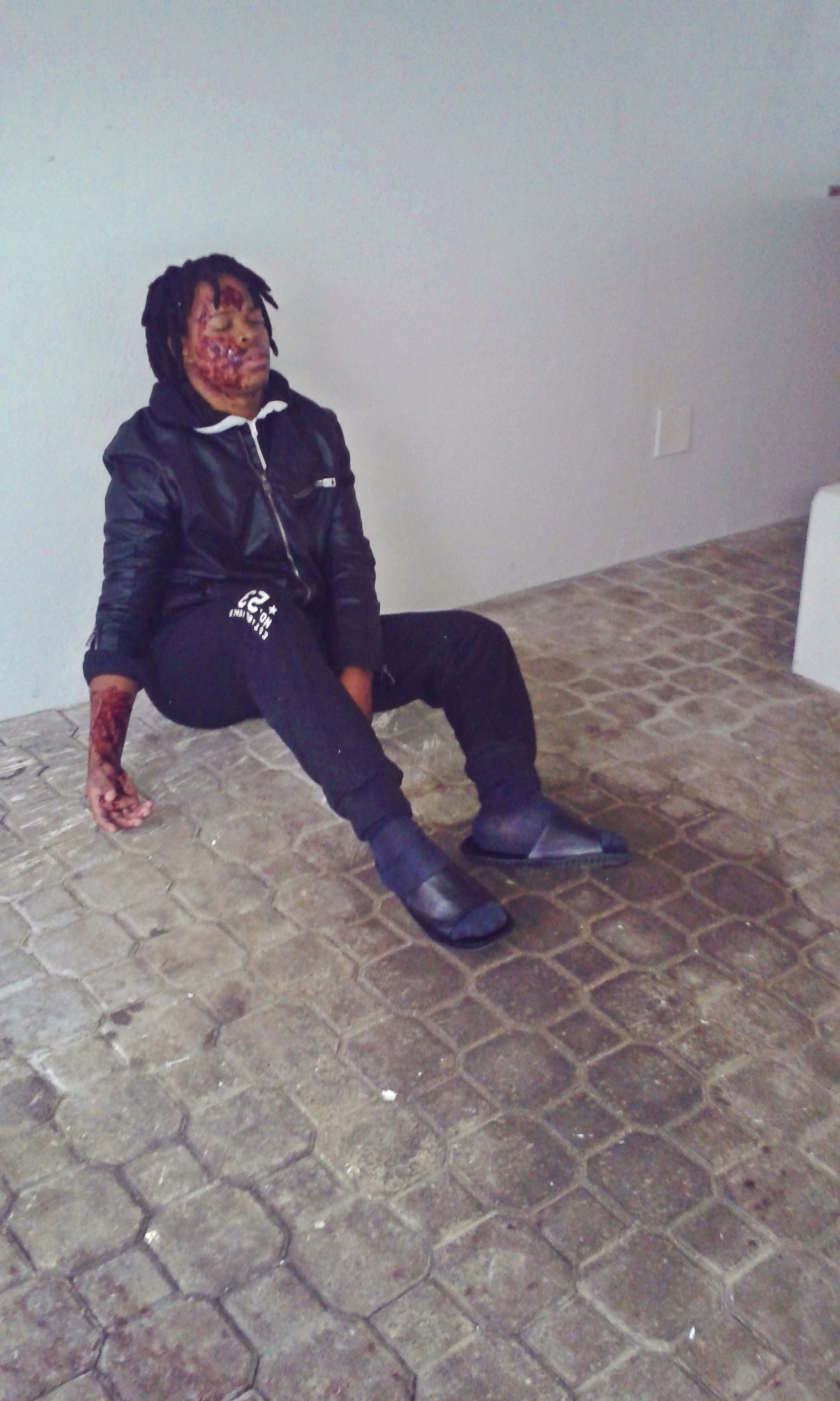
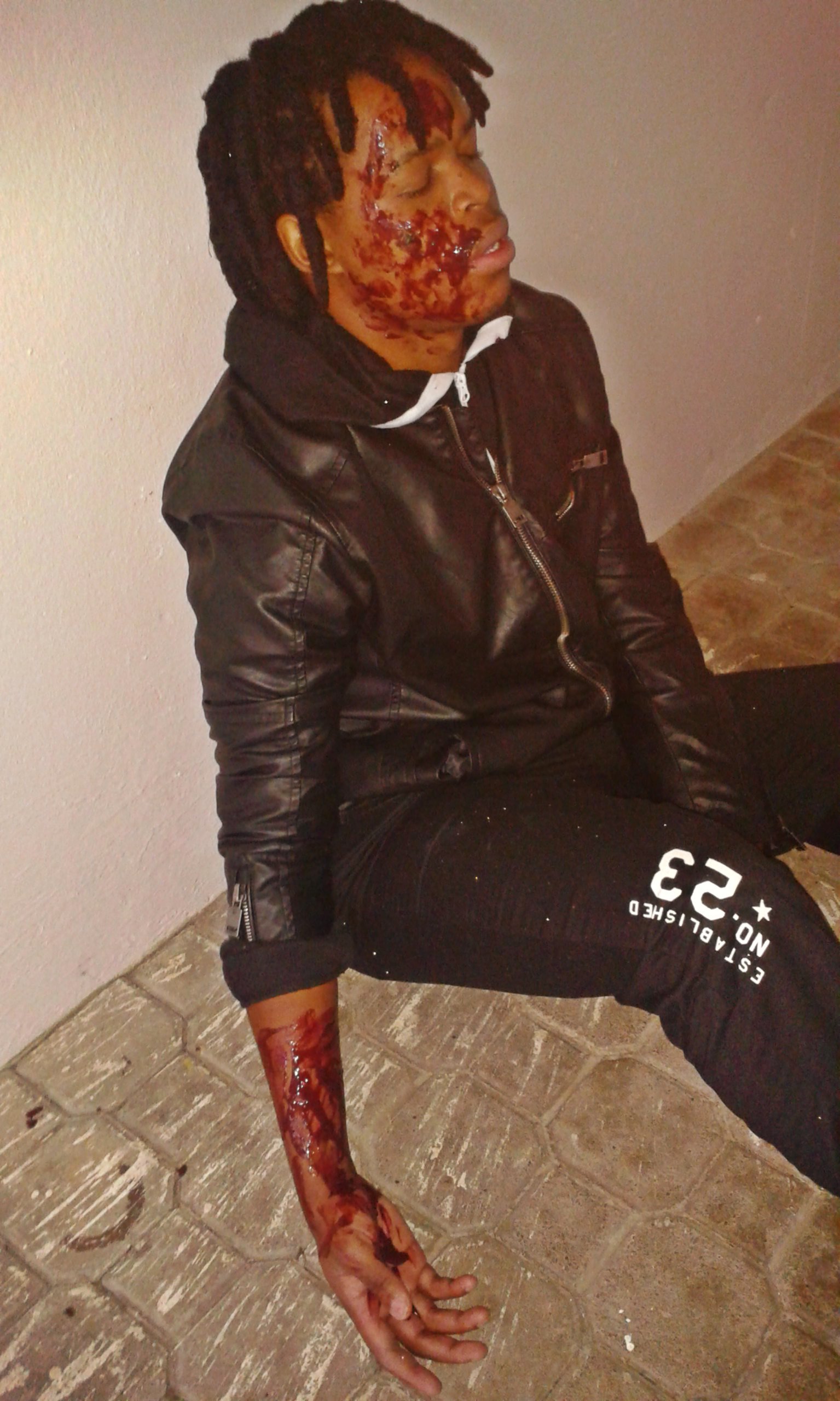
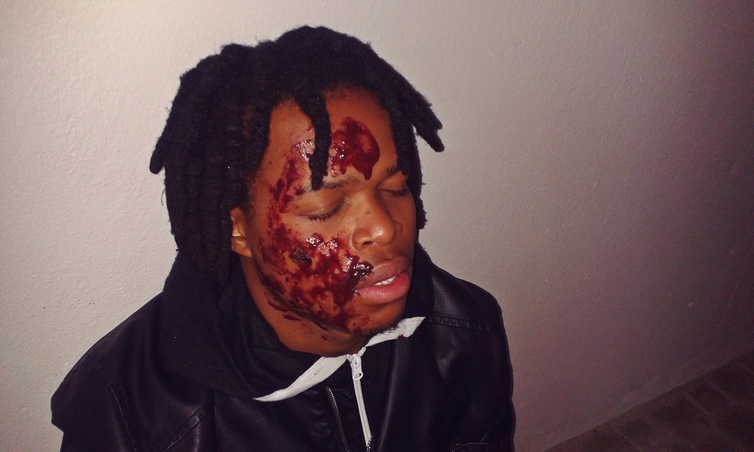
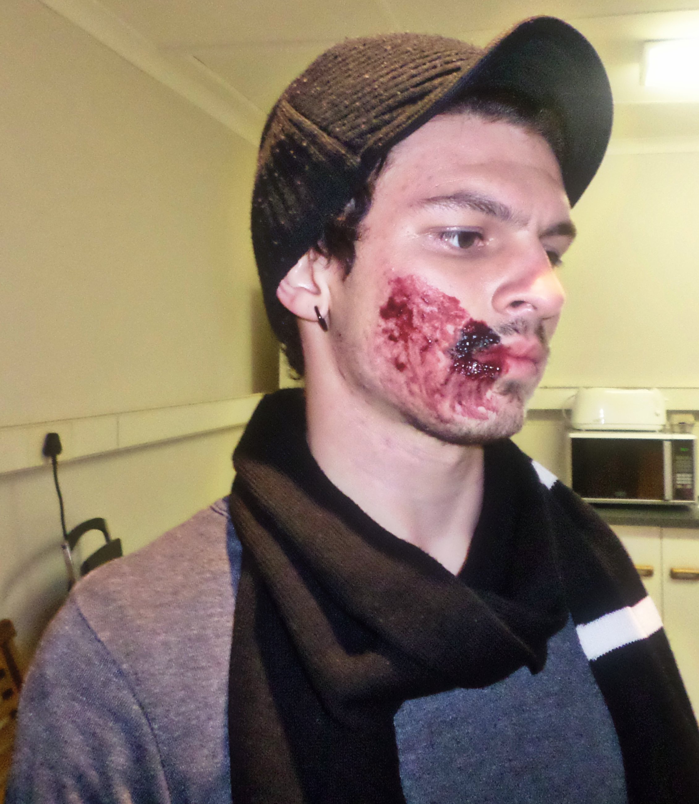
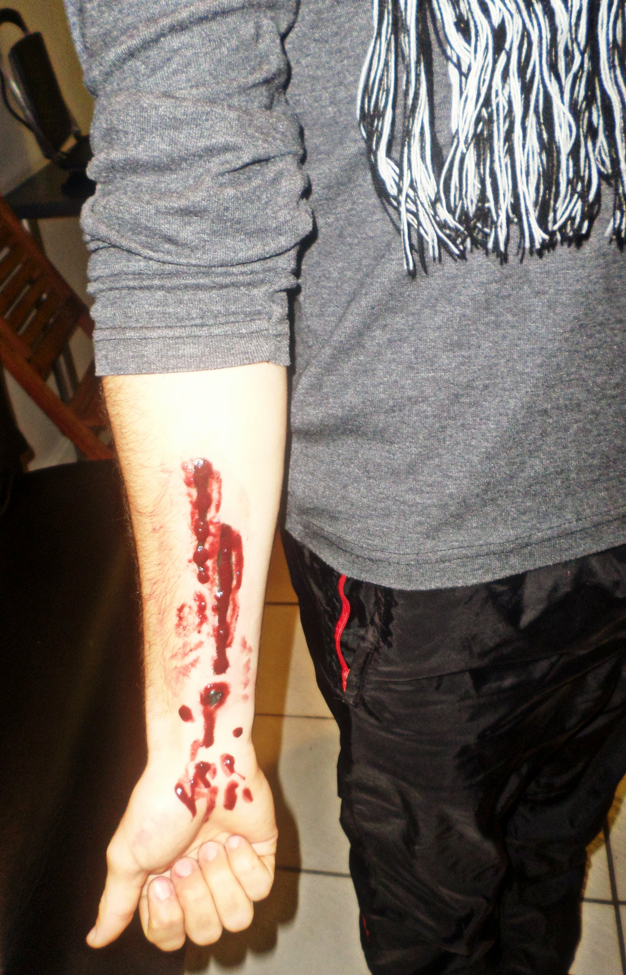
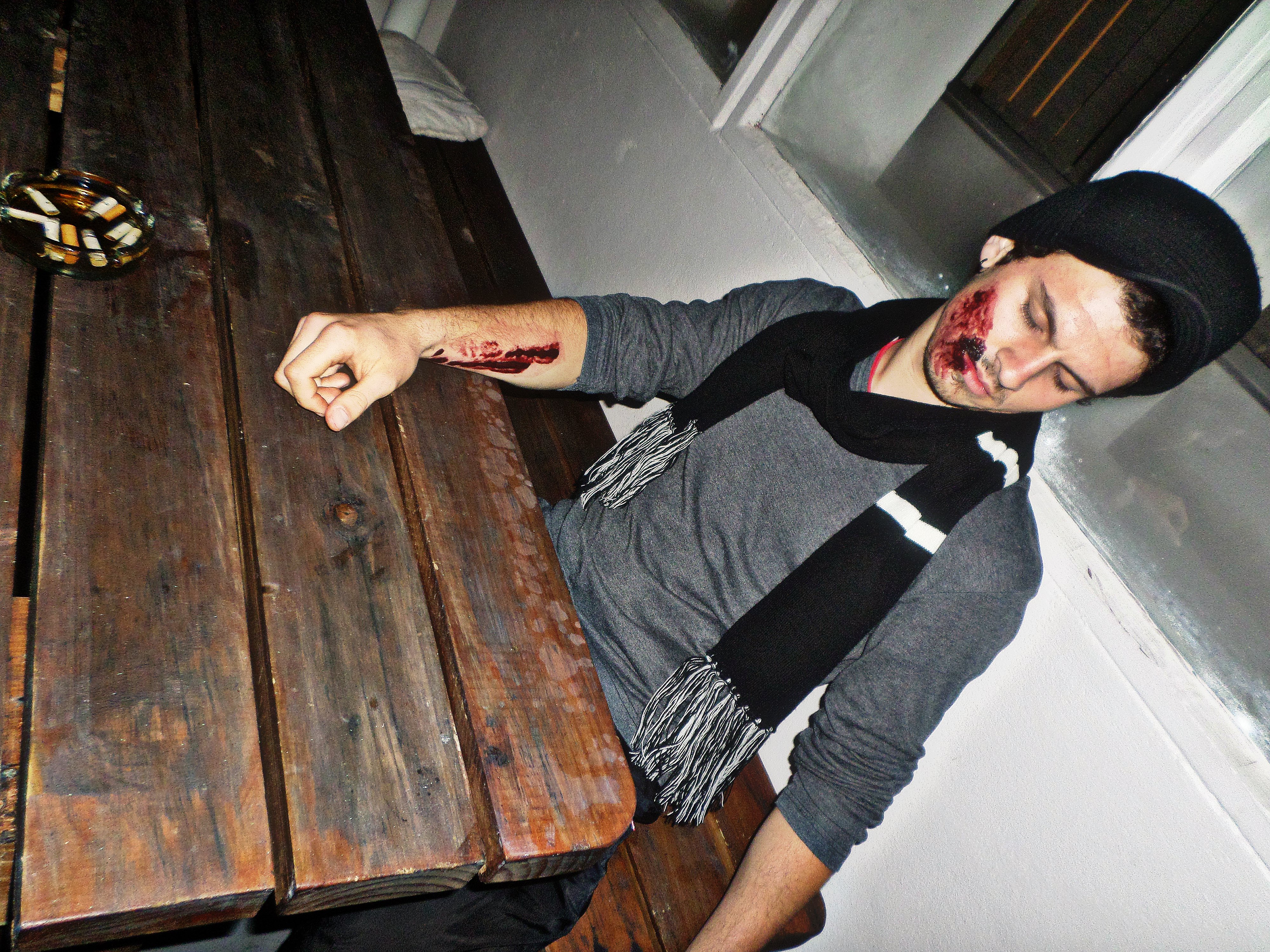
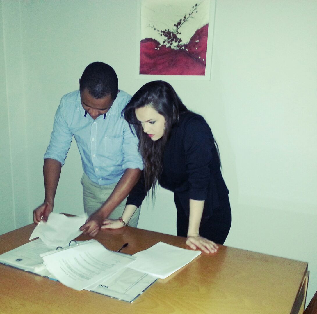
For our first year film, namely ‘Renegade’.
For our first year film, namely ‘Renegade’.
For our first year film, namely ‘Renegade’.
This class was seriously interesting.
Mind = Blown
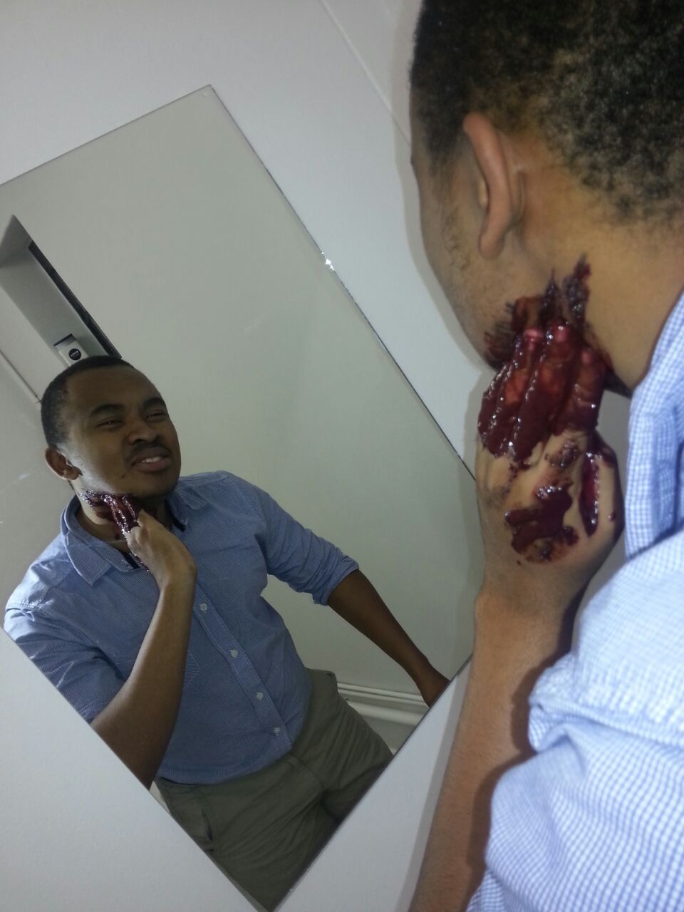
I really enjoyed Mr Ivy’s food demonstrations, the special effects makeup and the videos he showed us about learning to accept “the nothing”. It caused me to self-reflect with some existentialist questions.
Taking CMS and PD this term was super fun and I actually think it should be compulsory for all first years 🙂
I honestly feel like this article speaks the truth on mood boards: http://www.webdesignerdepot.com/2008/12/why-mood-boards-matter/
I enjoy creating mood boards because, as I’ve posted before, I really love experimenting with colour in design. Even though it can be a tedious process (especially when you make one as a collage in Photoshop) it really is worth it in the end. I have 2 upcoming mood boards to create for CMS – one about our film concept and one about the characters.
Below is a mood board collage template I designed to make life easier when time constraints exist 🙂 
Corn syrup for who! 🙂
“…To create a narrative world that will transcend to you viewing audience the understanding of colour is vital. For this assignment you will create a fictional world that could be based on your narrative film or on a world you want to create only for this project. The world needs to be supportive of a character…”
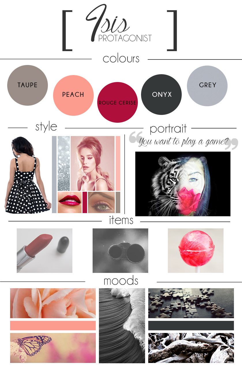
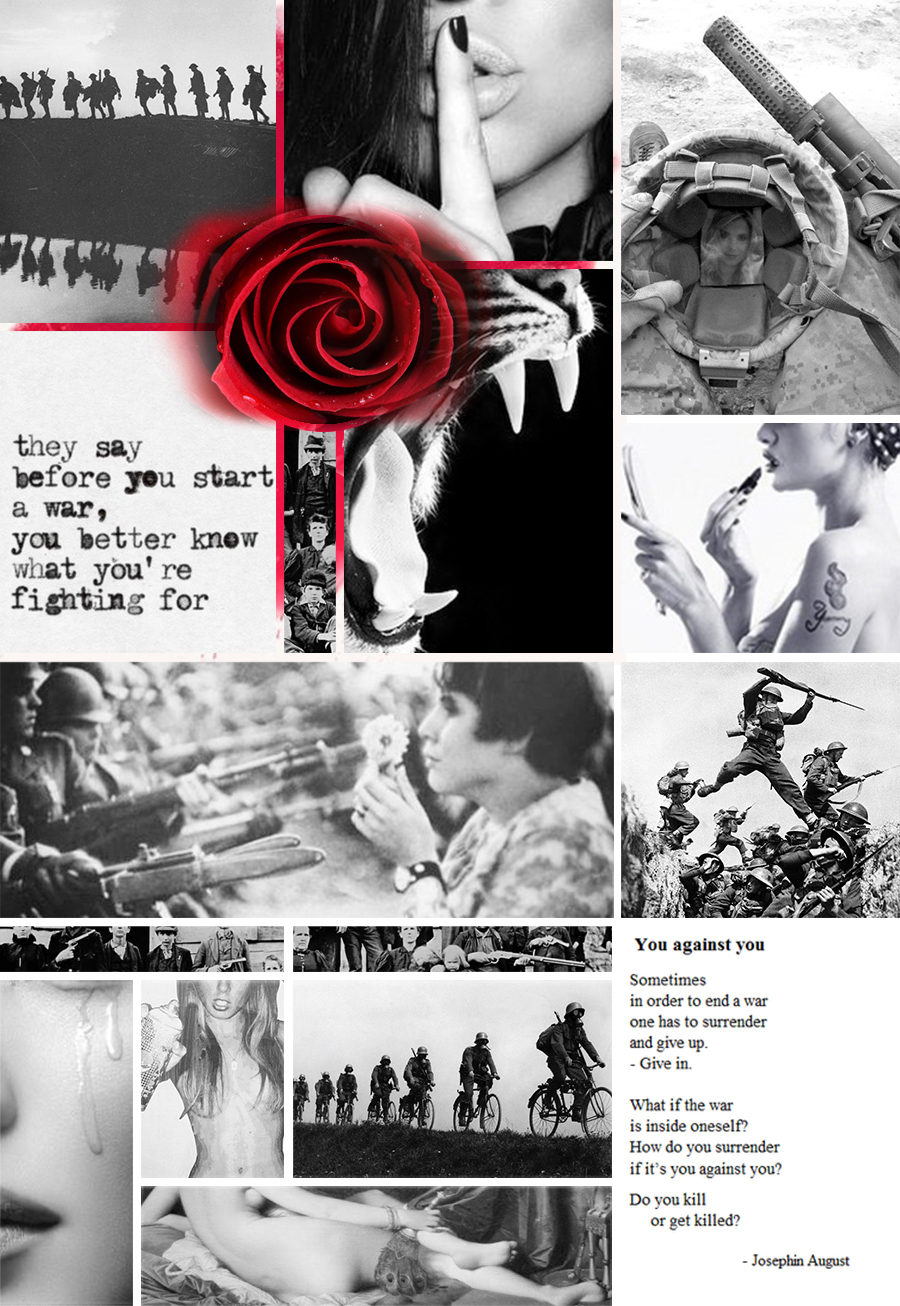
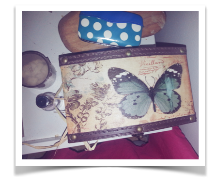
For this assignment, I have chosen to use the narrative story from my serial killer project for CMS. For that project, my protagonist is a trained female assassin. I chose to use an assassin instead of a serial killer because the psychological development of this character is fascinating. The motivation behind this concept was to explore the psychology surrounding an organised, premeditated murder – especially when the protagonist refuses to see it as murder, but rather, as justice.
Explanation of Mood Board
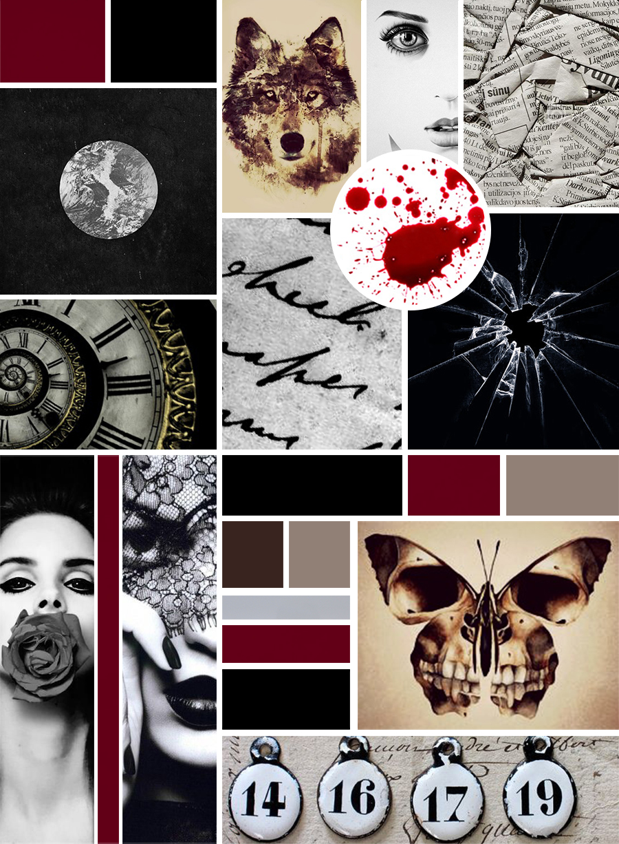
The mood board attempts to represent Vivian psychologically through use of colour schemes and semiotics. The eye is naturally drawn to the blood splatter and it holds a certain shock factor to it, ultimately keeping one’s attention to delve in further. The many uses of a circular shape reveal how whatever Vivian and Jim discuss is between them only – enclosed to never be passed on.
The numbers are symbolic of Vivian’s victims, as she only sees them as numbers. The butterfly that has a skull on its wings and the wolf are both symbolic of the same thing: innocence and appearance versus reality. Vivian, someone so young and beautiful is a killer. This is why both images are the same taupe and chocolate brown colour scheme.
The grey circle with a black background is representation of Vivian’s enclosed turmoil of emotions, in order to maintain her sanity and block off any sense of self. It is the only way she can save herself from feeling anything about what she does. The twisted clock shows the passage of time between the killings and also planning of killings. The black and white handwriting also shows how the murders are premeditated and the crumpled up newspaper shows how Vivian refuses to know how her killings could affect anyone or anything.
Vivian’s reaction of shock, above the blood, is her reaction upon discovering that Jim killed her mother. She has just stepped out the shower, when an anonymous person had sent her a clip of the incident. She almost does not want to believe that it was Jim. The shattered glass image reflects this feeling.
The rose covering Vivian’s mouth shows how she’ll never tell anyone who she really is and what she really does. Only ‘good’ things will come out her mouth when speaking to others. The lace covering Vivian’s eyes is symbolic of the moment she secures Jim, as well as how she refuses to notice the reality of her murderous acts. The burgundy blood colour in between these two images is like a stream of blood and it creates this effect for the rest of the mood board as well.
The colours of focus are presented on the mood board: black, burgundy blood red, taupe, chocolate brown and steel grey. These colours are repetitive throughout the narrative, but are most prominent when Vivian’s psychology changes when certain events occur near the end of the story. In this way, these colours effectively enhance the emotional relevance of the protagonist throughout the narrative.
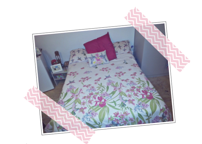
The realness of the student struggle (and my curiosity) led me to the prop shop, where you are able to rent props for a fee. It’s amazing to see typical, everyday items now dubbed as props.
The burgundy material (on top of pile) will prevent paint missions and help save financially.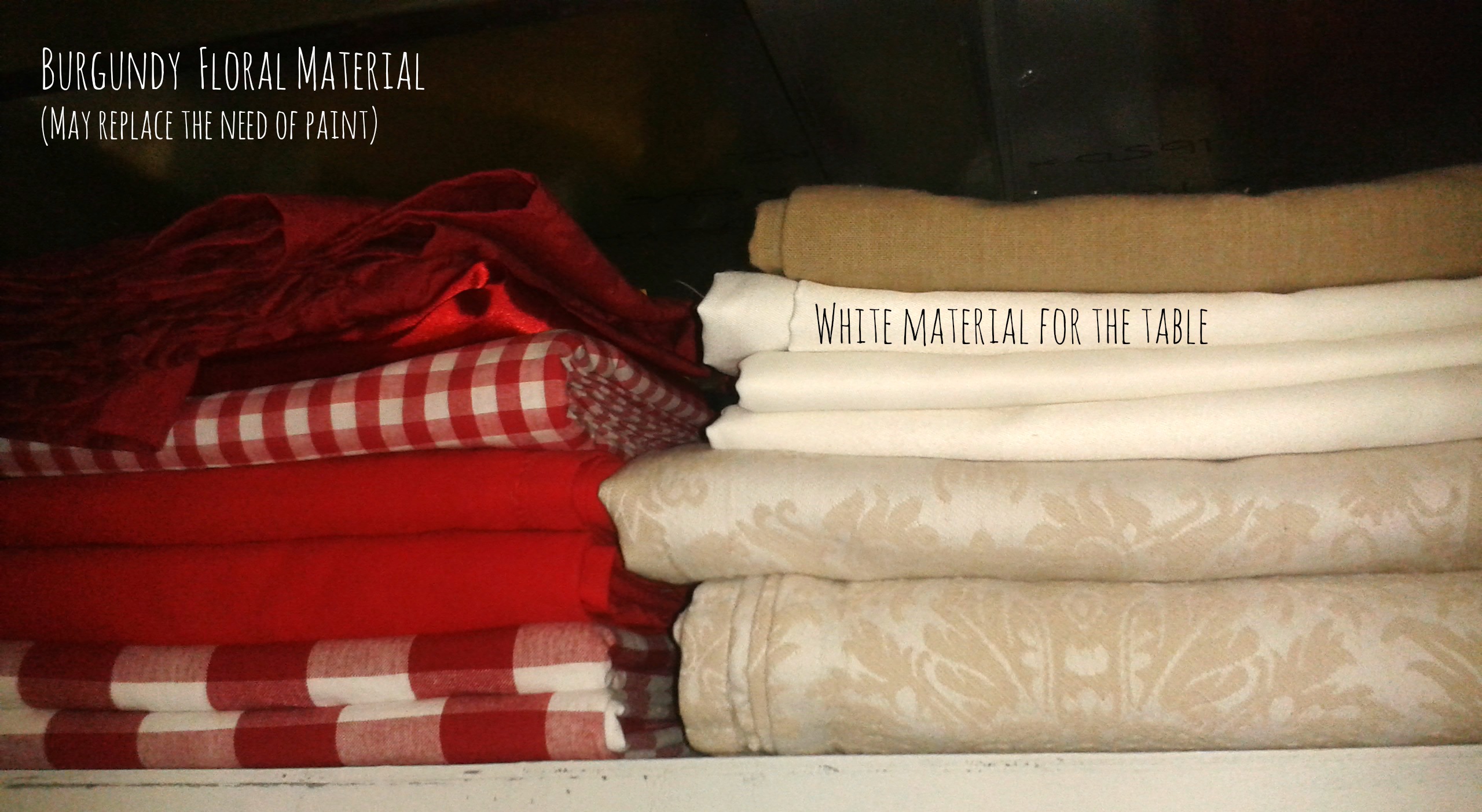 Wine glass for that grape juice.
Beautiful.It was like shopping for a house.

Ignore the transparent beauty. I just didn’t want to fiddle.
Production Design really interests me in the sense that you can decipher A LOT from the aesthetics of a film.
I learnt that everything (everything) placed on a set has to have meaning. (Isn’t that the purpose of film anyway? Man’s unending search for meaning). Everything placed in a scene has to have some form of a purpose that is not solely for practicality reasons.
I learnt more about the ‘hierarchy’ of jobs within the film industry currently, and I definitely agree with Miss E that it should rather be a group effort – a collaboration of rich ideas and new perspectives from every crew member in the team. It reminded me about the mini experiment in a Production Course lecture: two groups of people had to be creative with plastic white cups. The one group, led by a single leader, produced a simple and straight-forward cup tower. The other group, with input from everyone, produced a very artistic cup tower. Enough said.
The assignments for Production Design seem creatively challenging, which I love. The one that seems the most challenging to me is the ‘Reinvention of a Fairytale’ assignment. I think it will become ‘easier’ once I actually have an idea of what modern day societal issue I want to confront.
Upon being reminded of Maslow’s Hierarchy of Needs, I learnt that this is a useful tool to help define one’s target audience. To have the ability to directly influence a specific audience is a great opportunity.
Below is a rough draft of my ideas and inspiration for my project group’s term 2 film.


