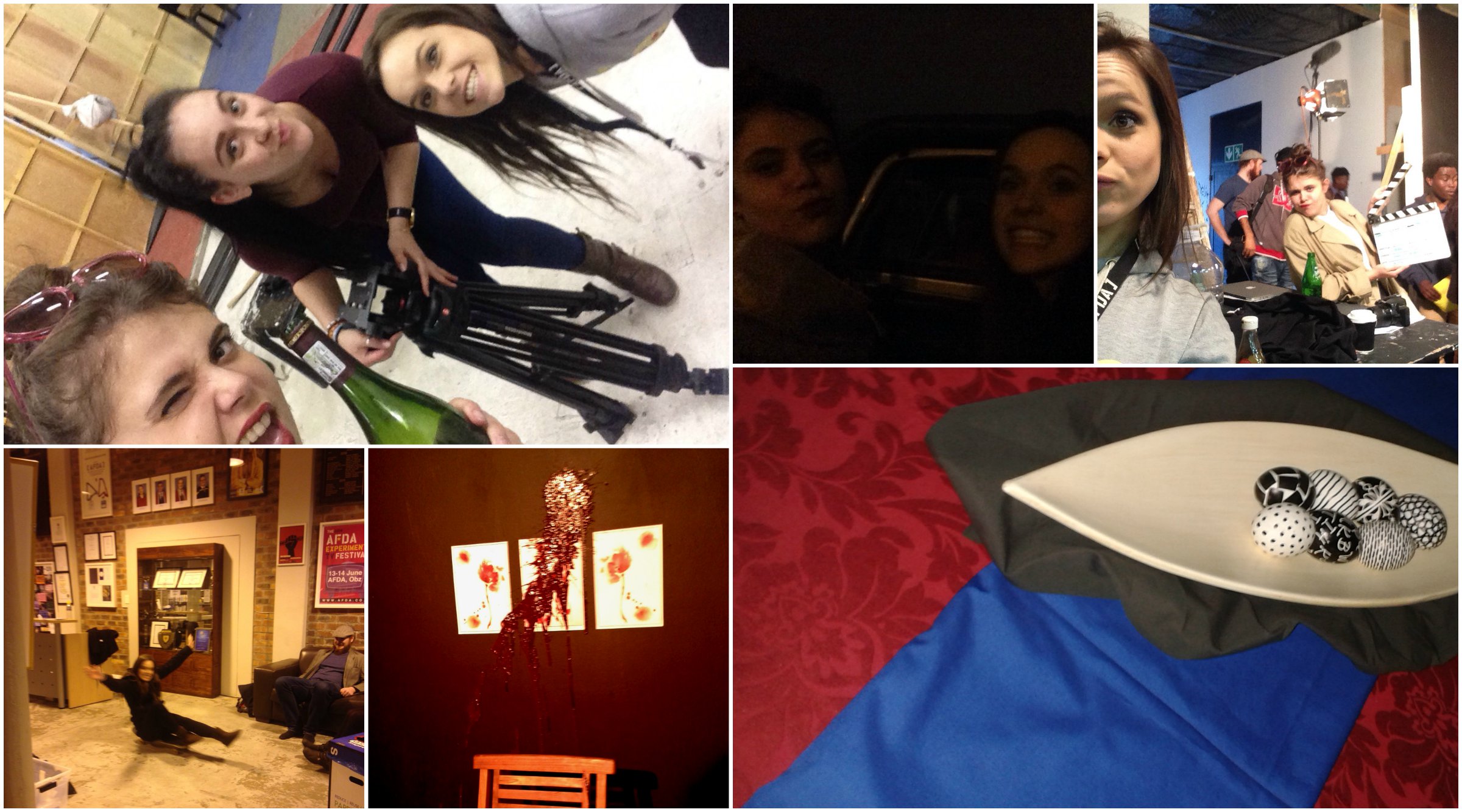
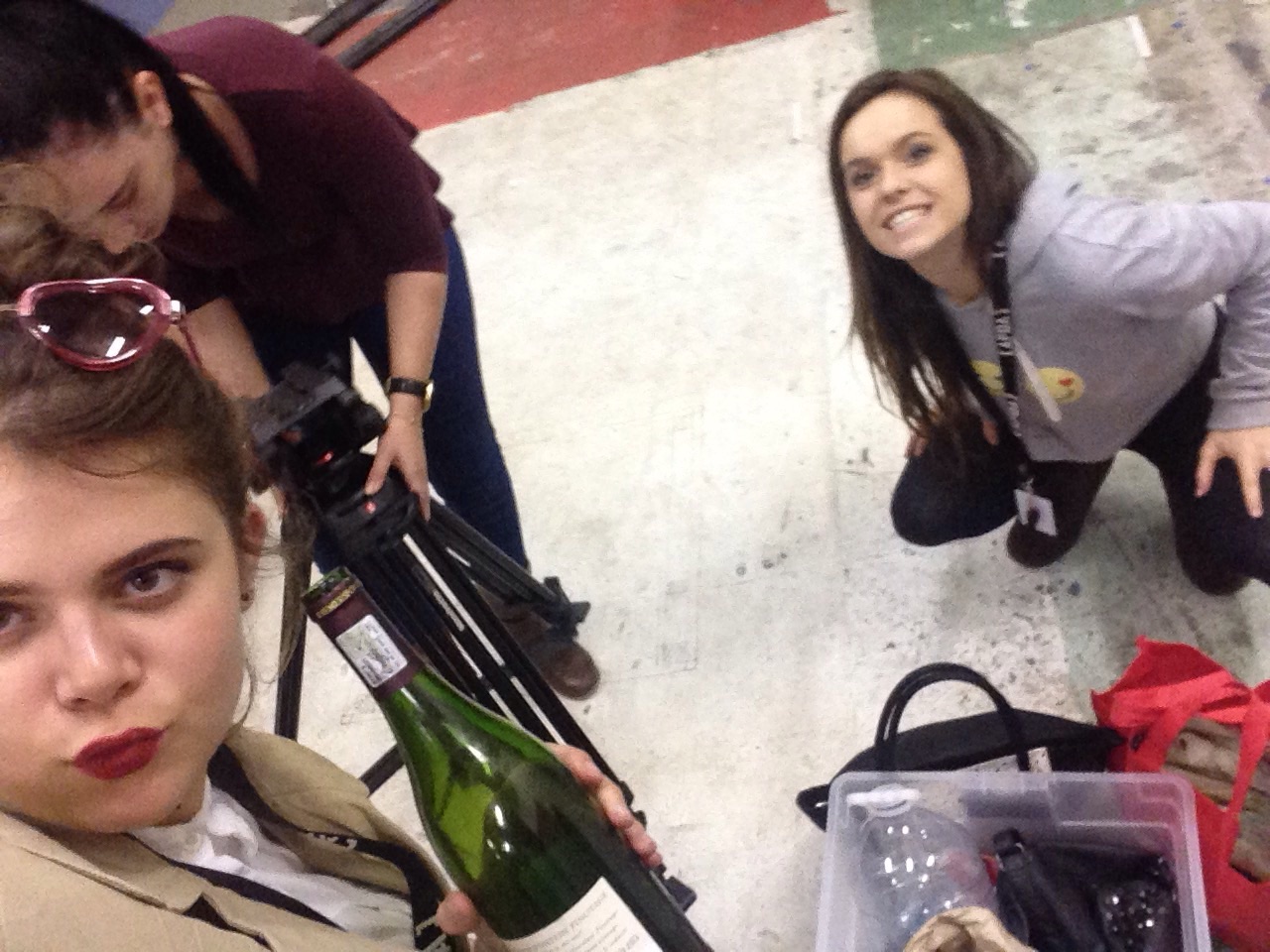
Fun times
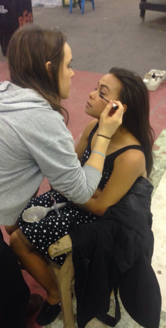
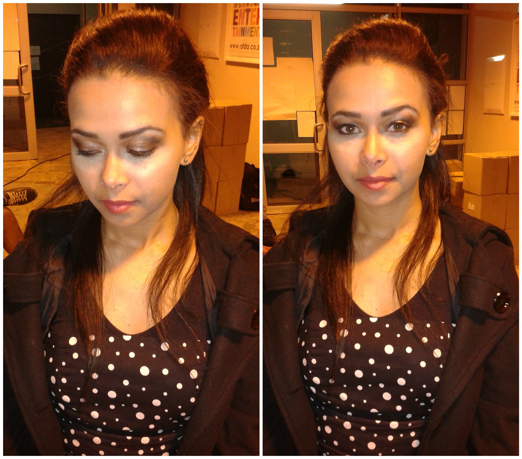
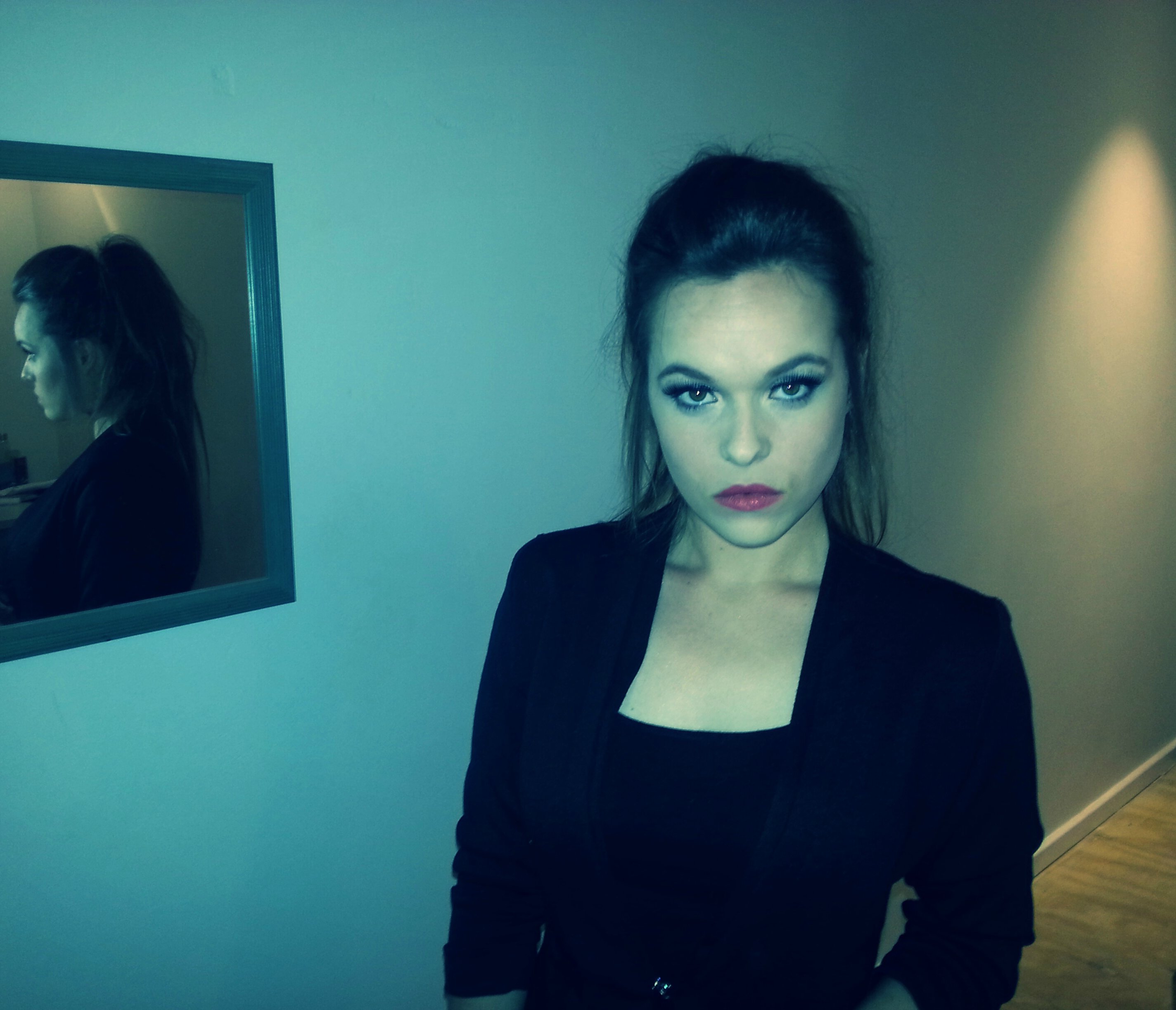
Makeup, Hair & Outfit
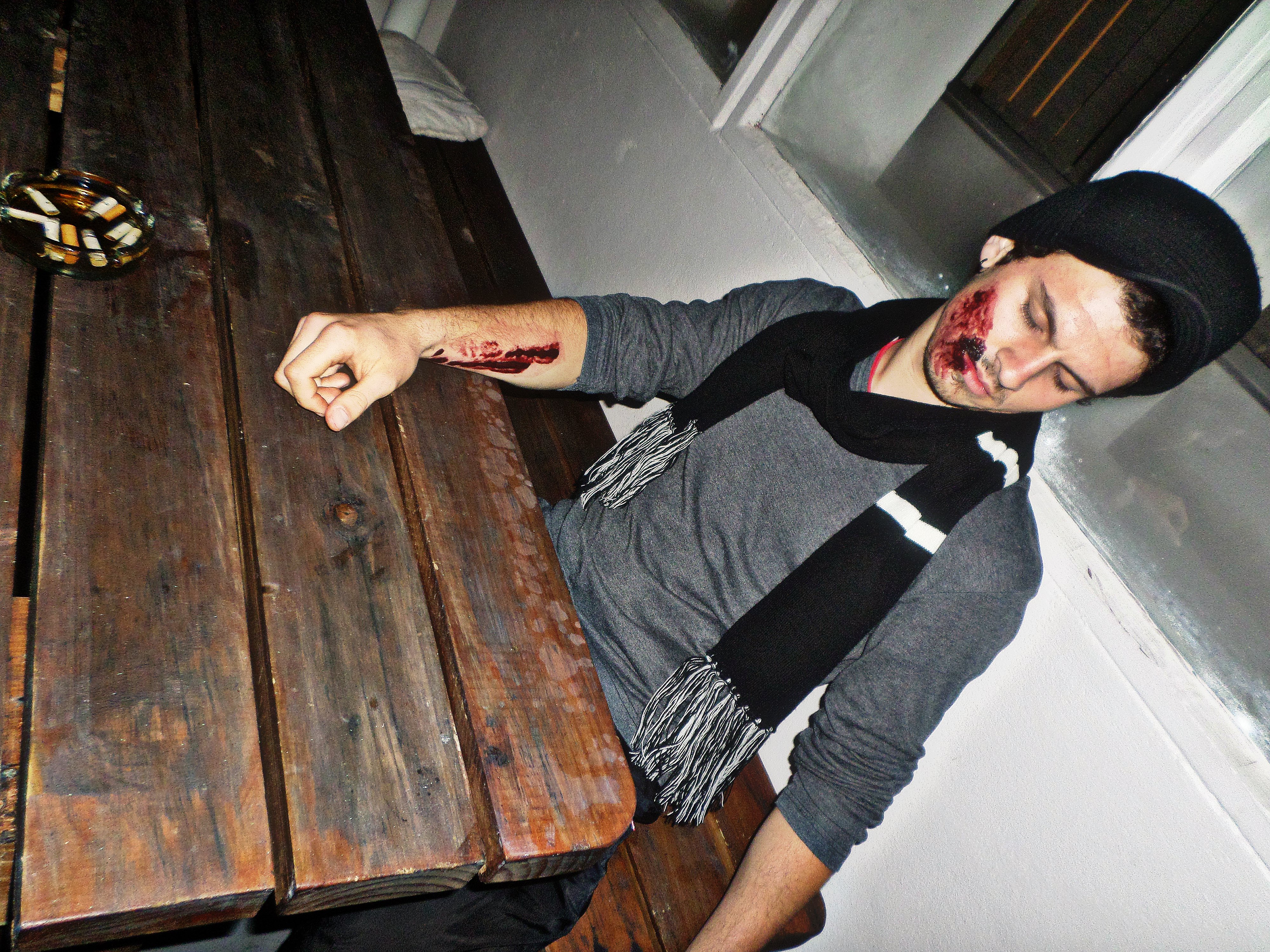
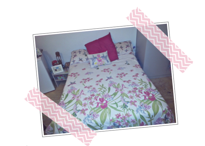
Production (set) Design for the dinner table scene
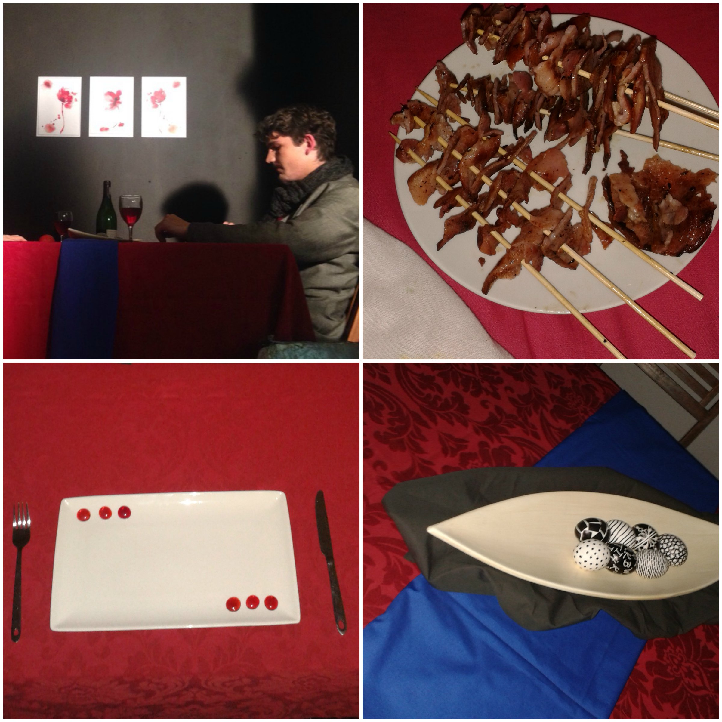
(the grape juice in that wine bottle prop though)
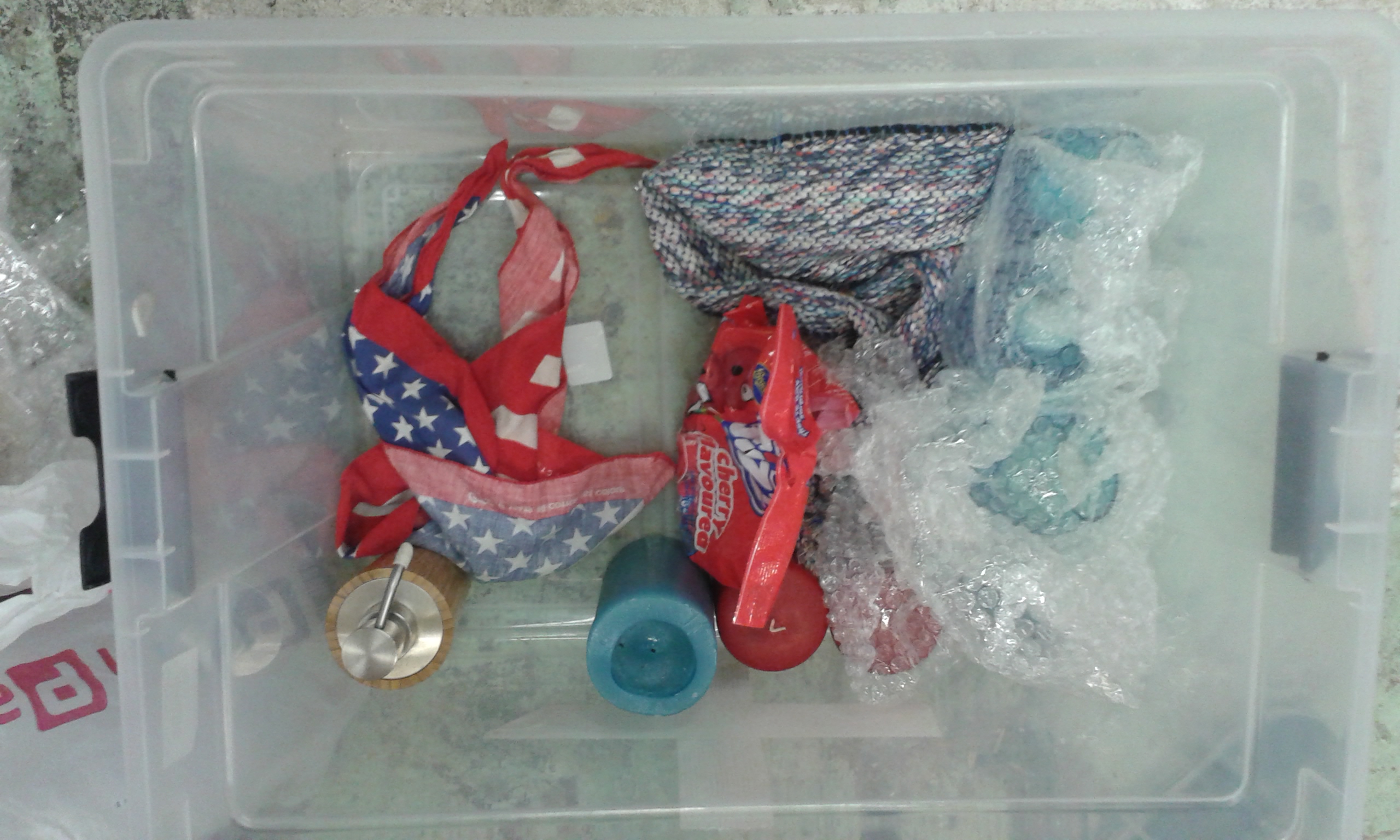
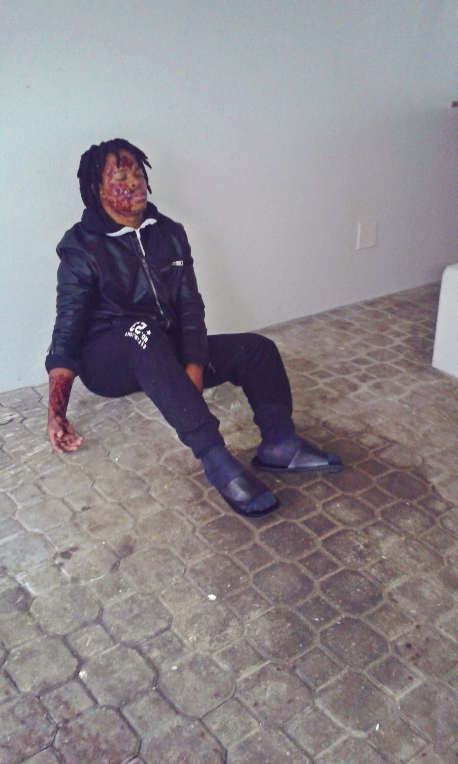
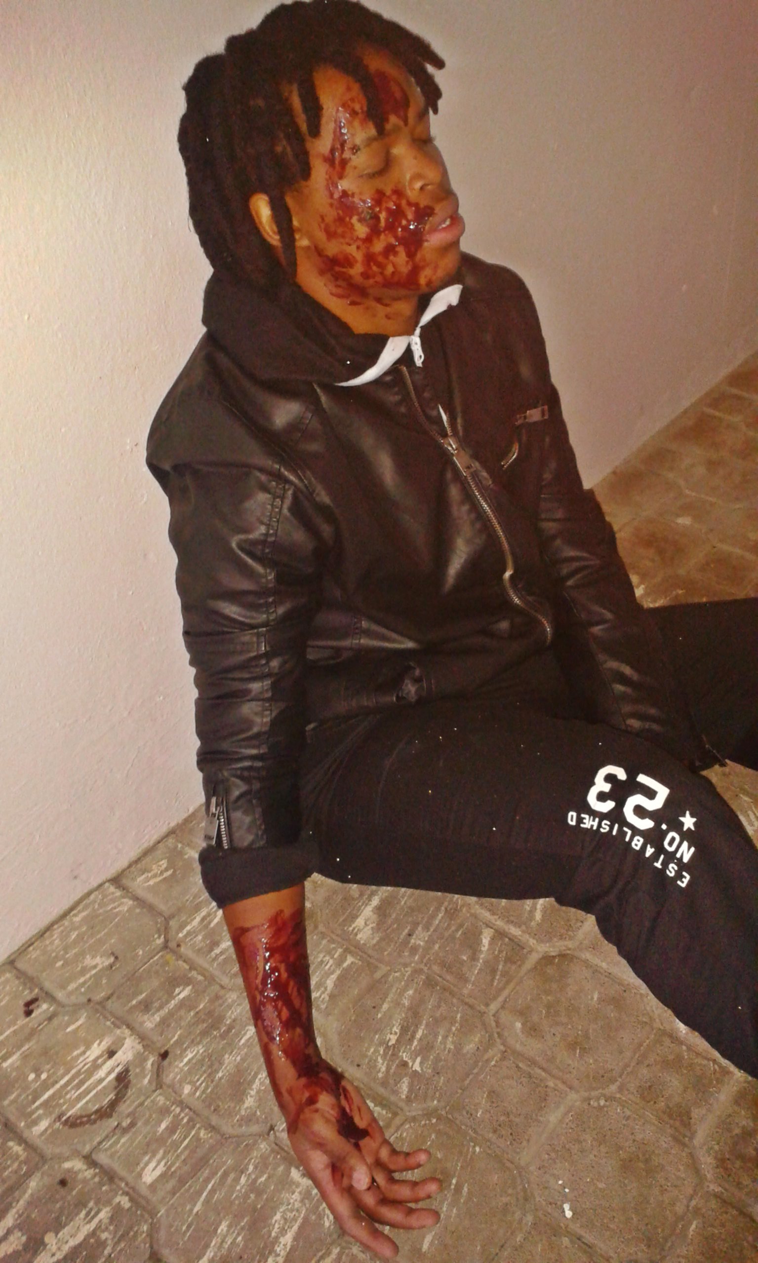
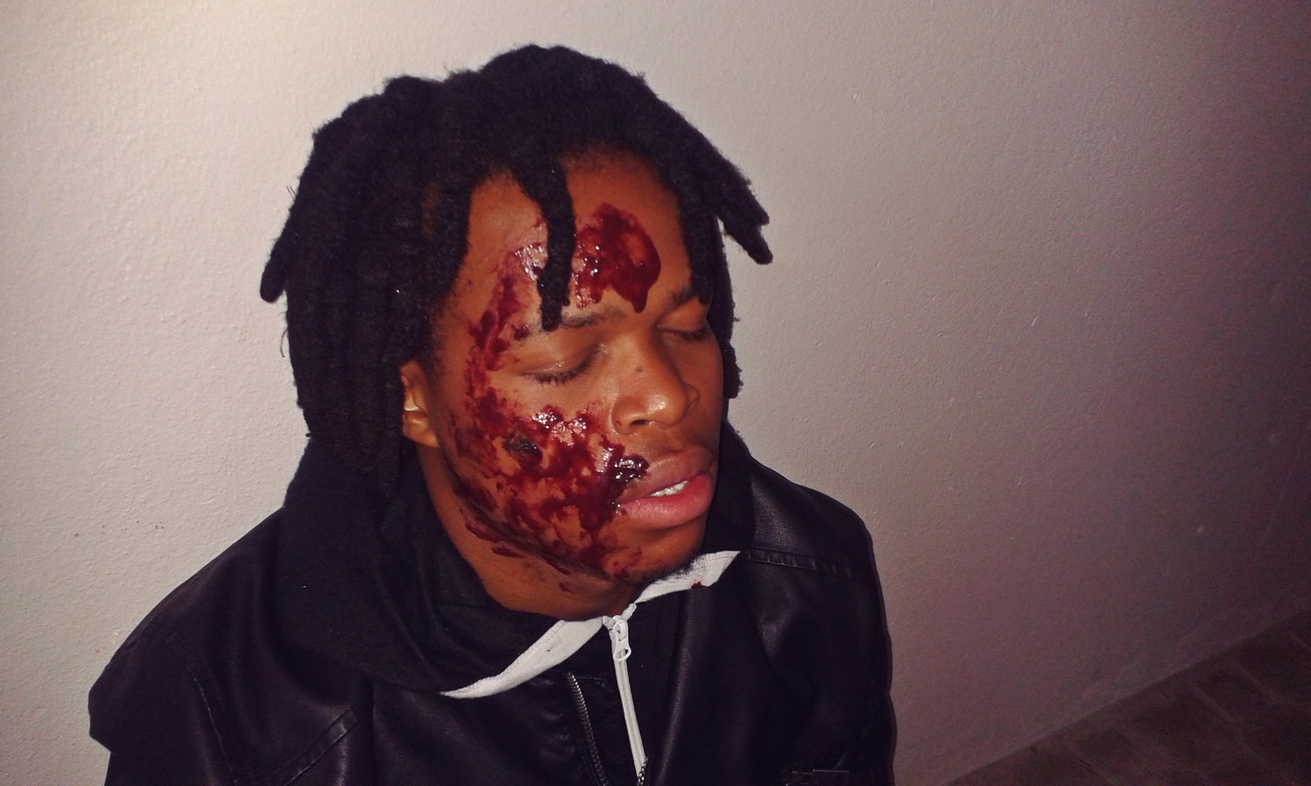
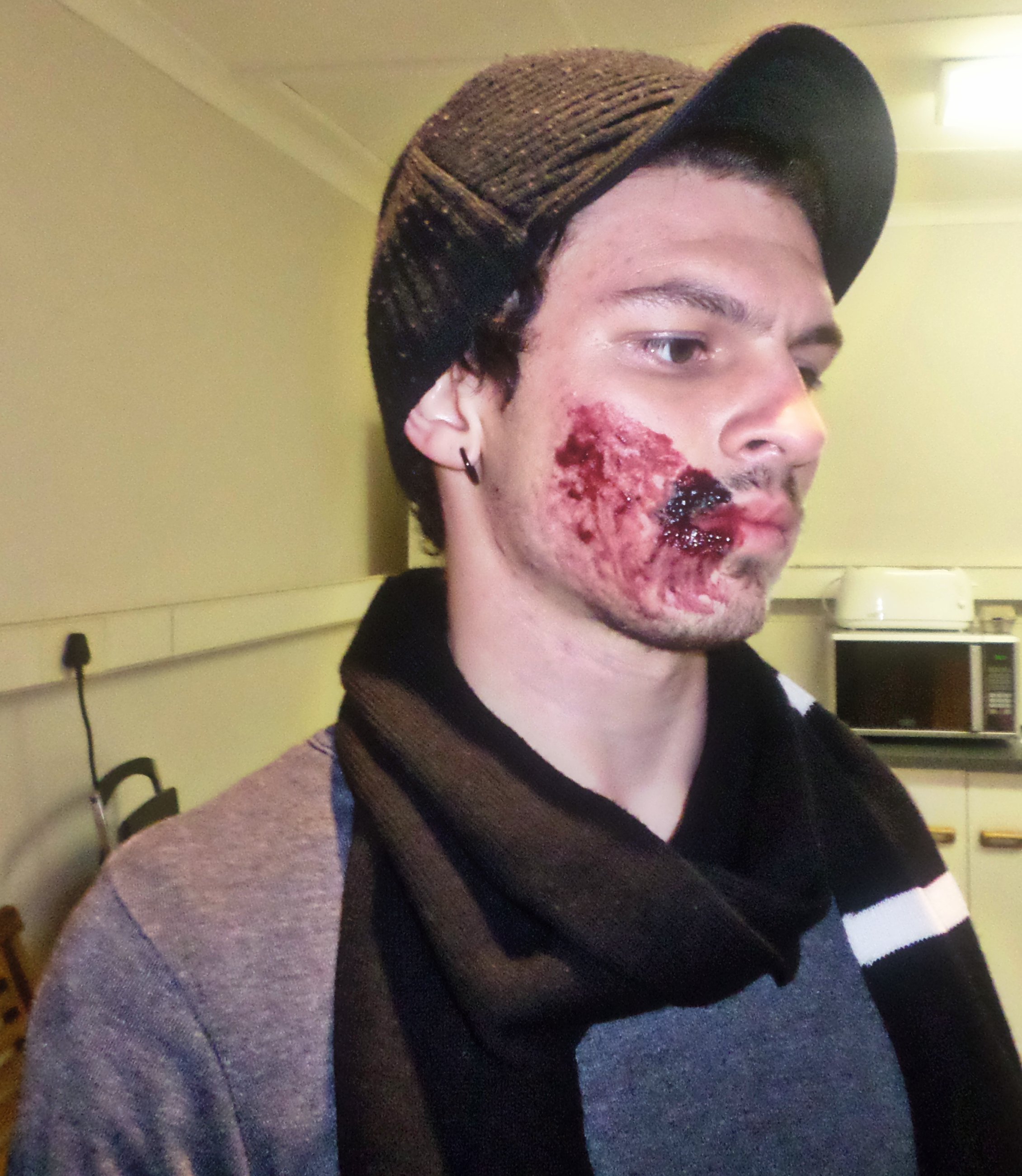
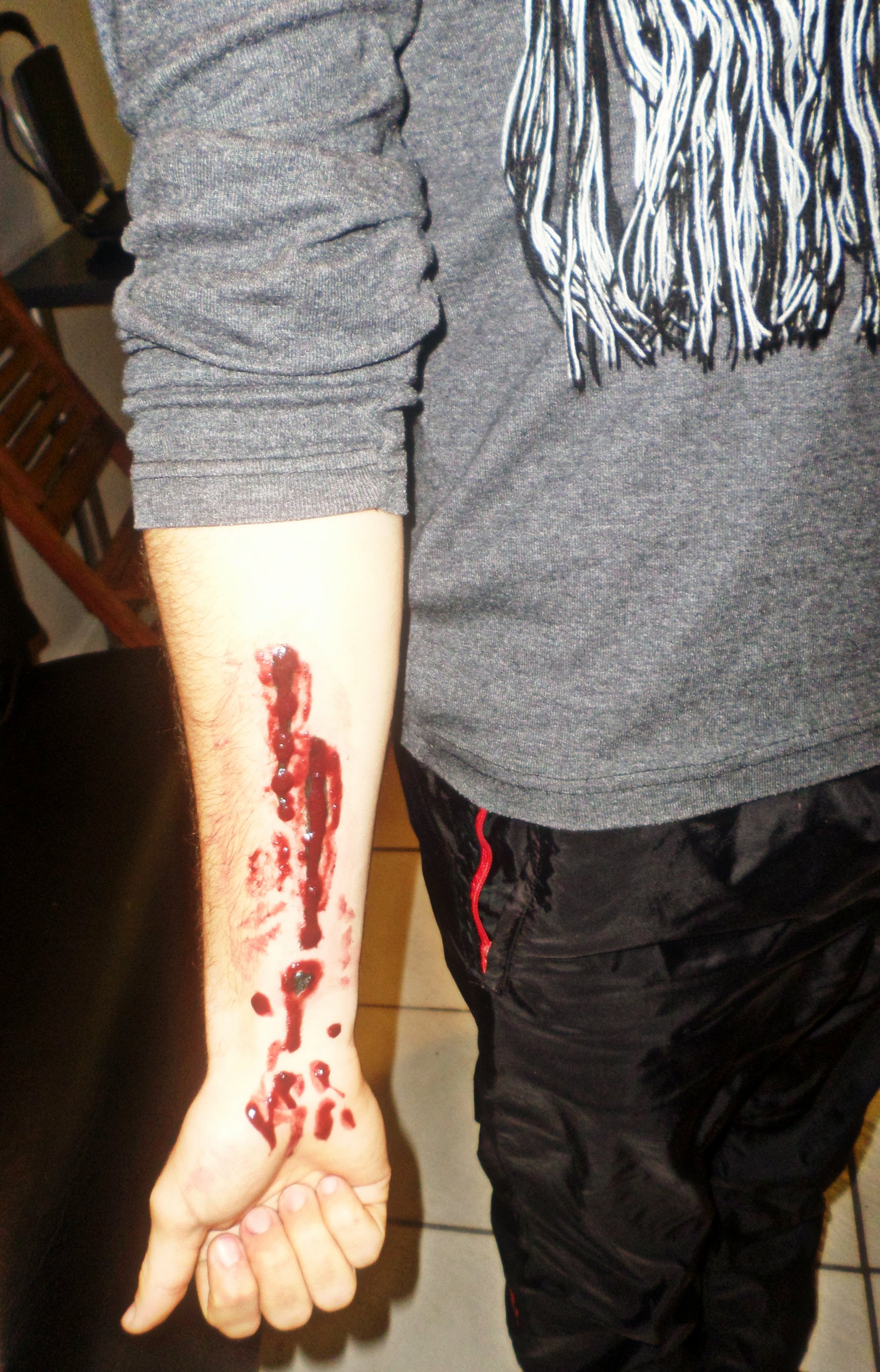
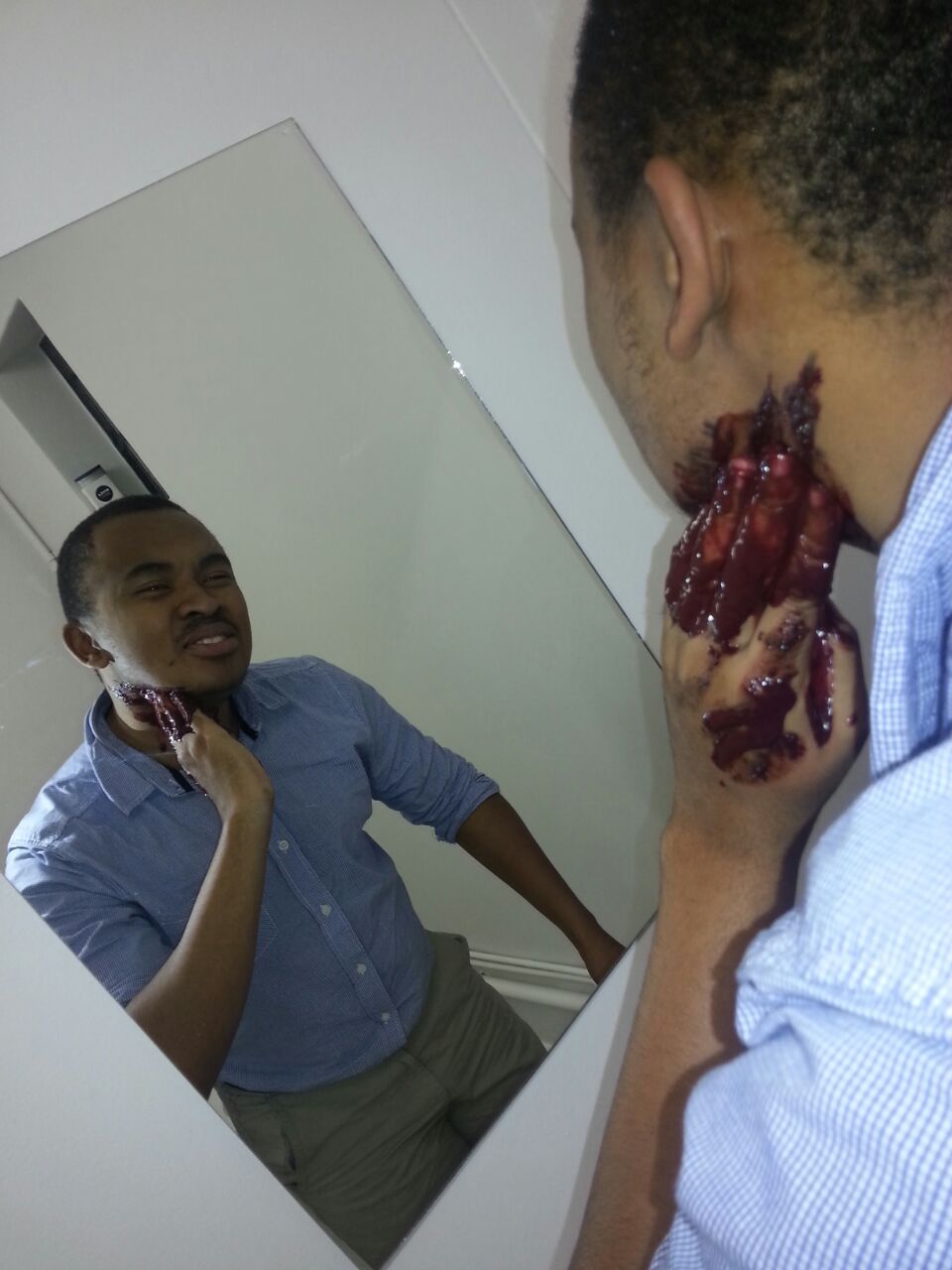
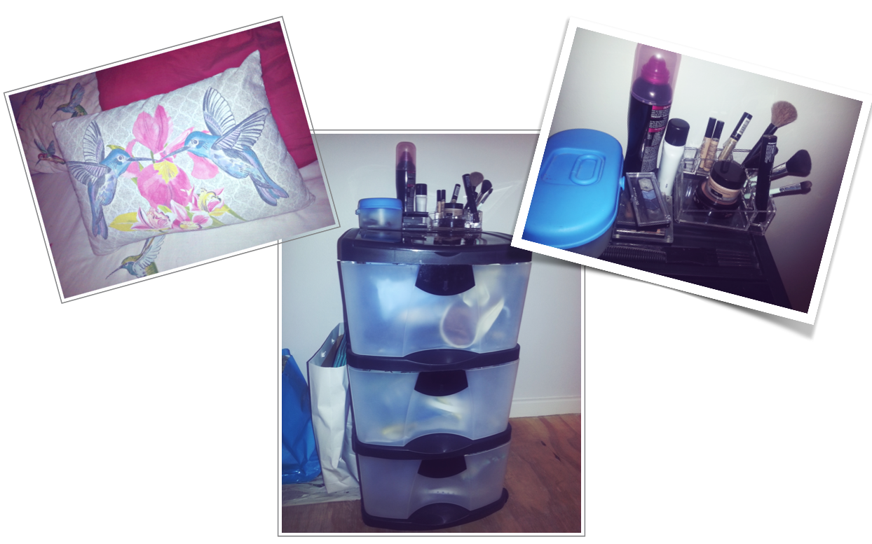
My box of tricks (props) for the bathroom scene
Fun times
Makeup, Hair & Outfit
Production (set) Design for the dinner table scene
(the grape juice in that wine bottle prop though)
My box of tricks (props) for the bathroom scene
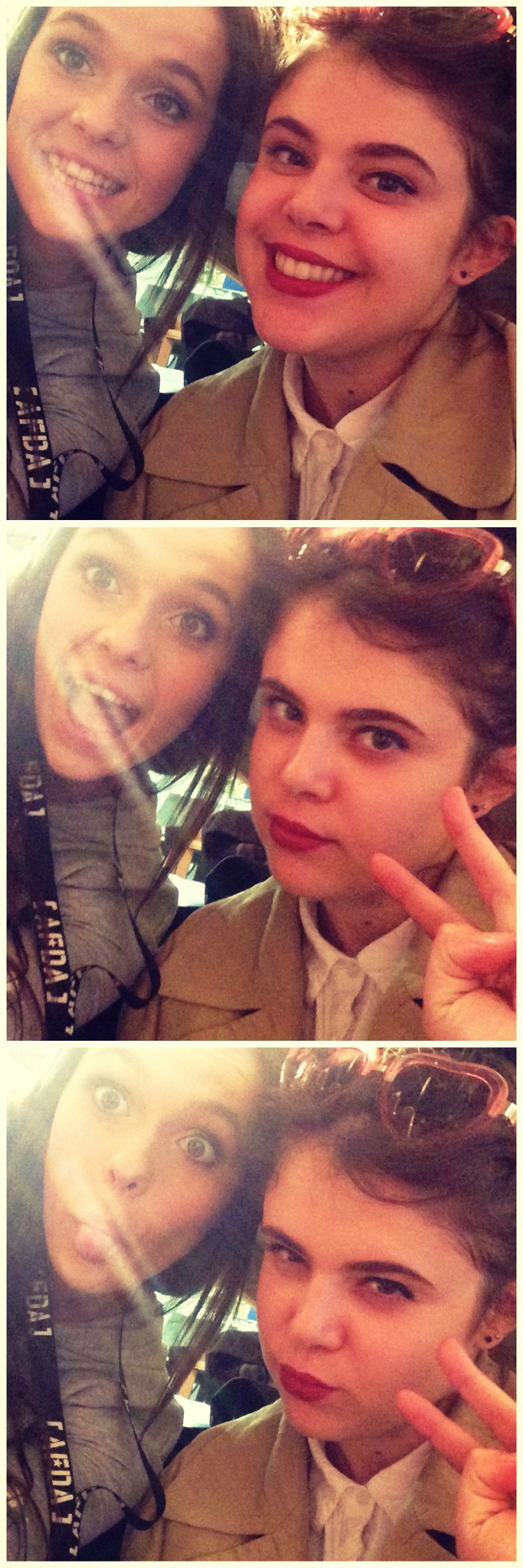
For our first year film, namely ‘Renegade’.
For our first year film, namely ‘Renegade’.
This class was seriously interesting.
Mind = Blown
I really enjoyed Mr Ivy’s food demonstrations, the special effects makeup and the videos he showed us about learning to accept “the nothing”. It caused me to self-reflect with some existentialist questions.
Taking CMS and PD this term was super fun and I actually think it should be compulsory for all first years 🙂
I honestly feel like this article speaks the truth on mood boards: http://www.webdesignerdepot.com/2008/12/why-mood-boards-matter/
I enjoy creating mood boards because, as I’ve posted before, I really love experimenting with colour in design. Even though it can be a tedious process (especially when you make one as a collage in Photoshop) it really is worth it in the end. I have 2 upcoming mood boards to create for CMS – one about our film concept and one about the characters.
Below is a mood board collage template I designed to make life easier when time constraints exist 🙂 
Corn syrup for who! 🙂
“…For this assignment the student must reinvent a fairytale of their choice to conceptually fit within contemporary society.”
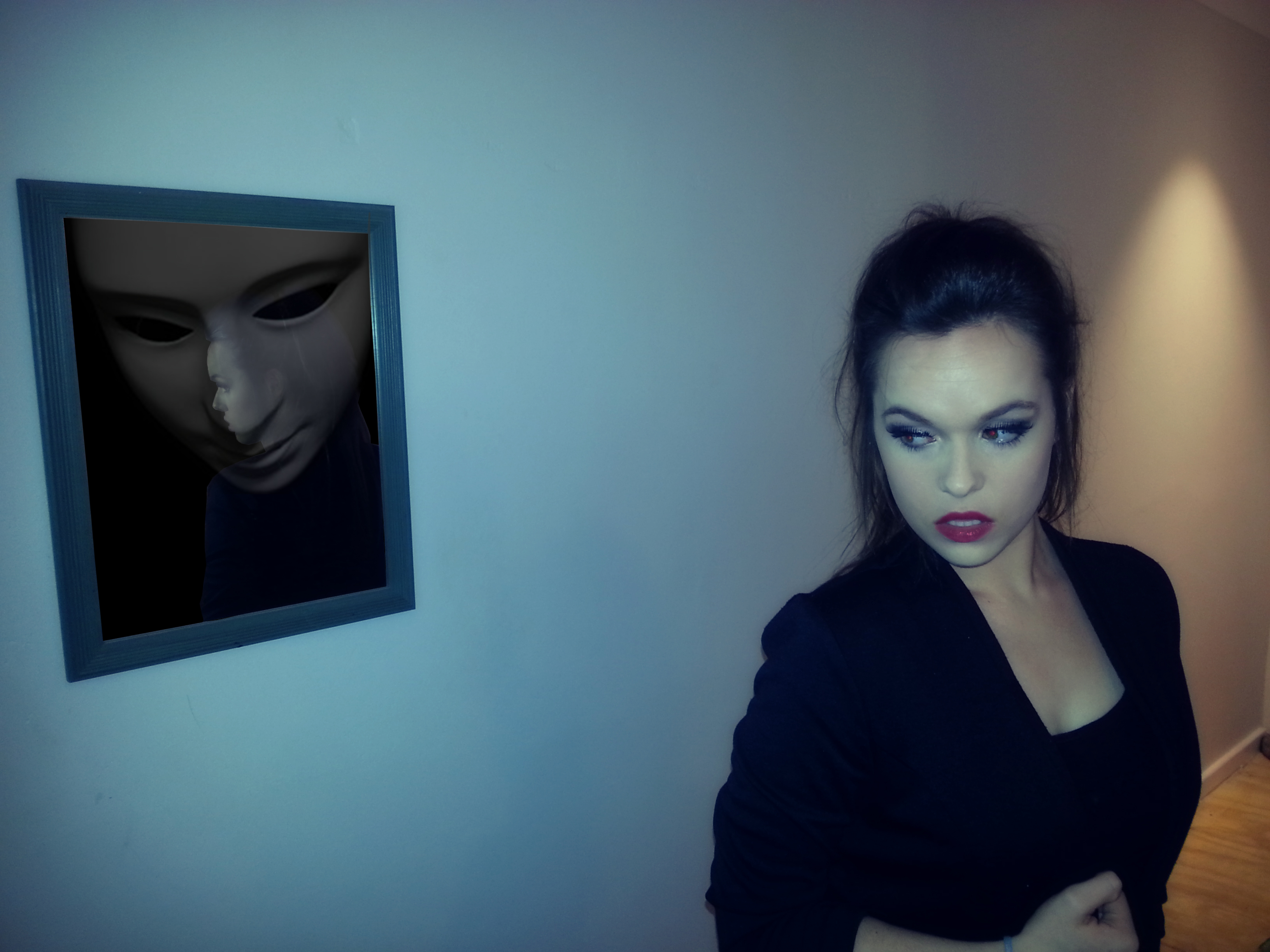 I have chosen to use the evil queen, and her magic mirror, from Snow White. I feel that this is a relevant issue in contemporary society, as we are surrounded by objectification of the human body in advertising and in the media. Our constant exposure to female-oriented advertisements may influence girls to become self-conscious about their bodies and to measure their self-worth based on their physical appearance (HealthyPlace, 2015). This may lead to eating disorders or plastic surgery. Therefore, the recurring themes that contrast with this image are body image and self acceptance (including the acceptance of others).
This image does not portray the drastic effects of ‘society’ on a person, but it does show how it could all begin. The image pertains specifically to females ages 18-30, who may be able to relate to an immense pressure from society, even sub-consciously. The image is therefore meaningful in this way.
I attempted to get the message across effectively by using colour and symbolism. The left side of the image is an icy blue colour, gradually fading into a warm orange colour (these are complementary colours). These colours reinforce each other and bring the image to life in an interesting way, because they also represent the subtext within the image, which I will touch on below.
The image deals with a present-day lady who has just settled into her career and faces the harsh realities of society on a daily basis. As a ‘professional’ lady in the working world, she tries to appear presentable and formal constantly. Sometimes she just wishes she could wipe her makeup off and be herself.
There is symbolism that links to the original fairytale, including the red lips on the lady and the masked face (‘magic mirror’) that represents society. The mask also has a secondary meaning to it, which links to makeup being almost a ‘mask’ in her world. The blue colour that fades into the orange colour reveals how she tries to focus on the positive things in her life, rather than the negative. Also, the close proximity of these colours show how easy it is for her to ‘turn off’ the effects of society, although this is just a temporary solution. The cold mirror frame and the warm light juxtapose heavily in the image. The Rule of Thirds effect has also been used.
Society is represented through a white mask, as it closely resembles the ‘magic mirror’ face and also because the word ‘society’ refers to all of us. I chose to keep her reflection in the mirror as the fade effect with the white mask gives the viewer a sense of intrigue and insecurity. The mask is looking down at her reflection, showing how she feels pressured, yet suppressed, by society. Since the lady’s character is based on the evil queen, it may also imply that she feels as though she needs to be the best or to appear the best in order to further herself in her career. It is up to the viewer to decide whether she is arrogant and selfish or if she is under immense pressure from society.
Reference:
HealthyPlace, (2015). Eating Disorders: Body Image and Advertising – HealthyPlace. [online] Available at: http:// http://www.healthyplace.com/eating-disorders/articles/eating-disorders-body-image-and-advertising/ [Accessed 1 Jun. 2015].
Bibliography
Bouwman, R. (2011). A physiological look at complementary colours « Van Gogh’s studio practice. [online] Vangoghsstudiopractice.com. Available at: http://www.vangoghsstudiopractice.com/2011/09/a-physiological-look-at-complementary-colours/ [Accessed 1 Jun. 2015].
“…To create a narrative world that will transcend to you viewing audience the understanding of colour is vital. For this assignment you will create a fictional world that could be based on your narrative film or on a world you want to create only for this project. The world needs to be supportive of a character…”
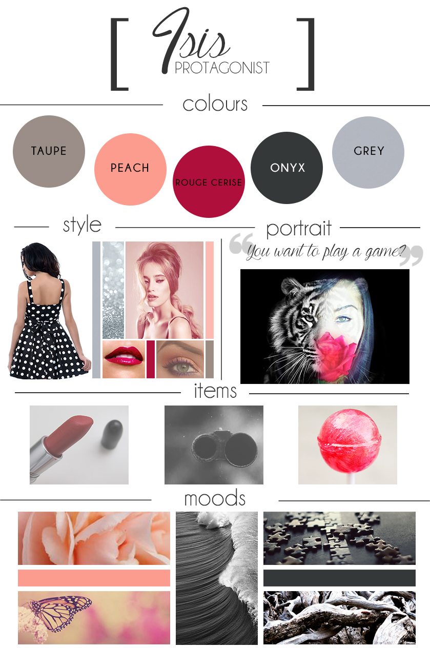
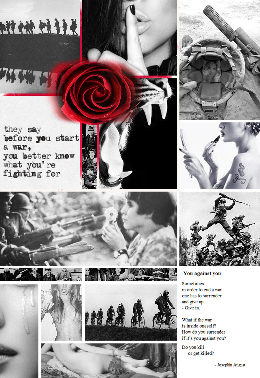
For this assignment, I have chosen to use the narrative story from my serial killer project for CMS. For that project, my protagonist is a trained female assassin. I chose to use an assassin instead of a serial killer because the psychological development of this character is fascinating. The motivation behind this concept was to explore the psychology surrounding an organised, premeditated murder – especially when the protagonist refuses to see it as murder, but rather, as justice.
Explanation of Mood Board
The mood board attempts to represent Vivian psychologically through use of colour schemes and semiotics. The eye is naturally drawn to the blood splatter and it holds a certain shock factor to it, ultimately keeping one’s attention to delve in further. The many uses of a circular shape reveal how whatever Vivian and Jim discuss is between them only – enclosed to never be passed on.
The numbers are symbolic of Vivian’s victims, as she only sees them as numbers. The butterfly that has a skull on its wings and the wolf are both symbolic of the same thing: innocence and appearance versus reality. Vivian, someone so young and beautiful is a killer. This is why both images are the same taupe and chocolate brown colour scheme.
The grey circle with a black background is representation of Vivian’s enclosed turmoil of emotions, in order to maintain her sanity and block off any sense of self. It is the only way she can save herself from feeling anything about what she does. The twisted clock shows the passage of time between the killings and also planning of killings. The black and white handwriting also shows how the murders are premeditated and the crumpled up newspaper shows how Vivian refuses to know how her killings could affect anyone or anything.
Vivian’s reaction of shock, above the blood, is her reaction upon discovering that Jim killed her mother. She has just stepped out the shower, when an anonymous person had sent her a clip of the incident. She almost does not want to believe that it was Jim. The shattered glass image reflects this feeling.
The rose covering Vivian’s mouth shows how she’ll never tell anyone who she really is and what she really does. Only ‘good’ things will come out her mouth when speaking to others. The lace covering Vivian’s eyes is symbolic of the moment she secures Jim, as well as how she refuses to notice the reality of her murderous acts. The burgundy blood colour in between these two images is like a stream of blood and it creates this effect for the rest of the mood board as well.
The colours of focus are presented on the mood board: black, burgundy blood red, taupe, chocolate brown and steel grey. These colours are repetitive throughout the narrative, but are most prominent when Vivian’s psychology changes when certain events occur near the end of the story. In this way, these colours effectively enhance the emotional relevance of the protagonist throughout the narrative.


