“…To create a narrative world that will transcend to you viewing audience the understanding of colour is vital. For this assignment you will create a fictional world that could be based on your narrative film or on a world you want to create only for this project. The world needs to be supportive of a character…”
For this assignment, I have chosen to use the narrative story from my serial killer project for CMS. For that project, my protagonist is a trained female assassin. I chose to use an assassin instead of a serial killer because the psychological development of this character is fascinating. The motivation behind this concept was to explore the psychology surrounding an organised, premeditated murder – especially when the protagonist refuses to see it as murder, but rather, as justice.
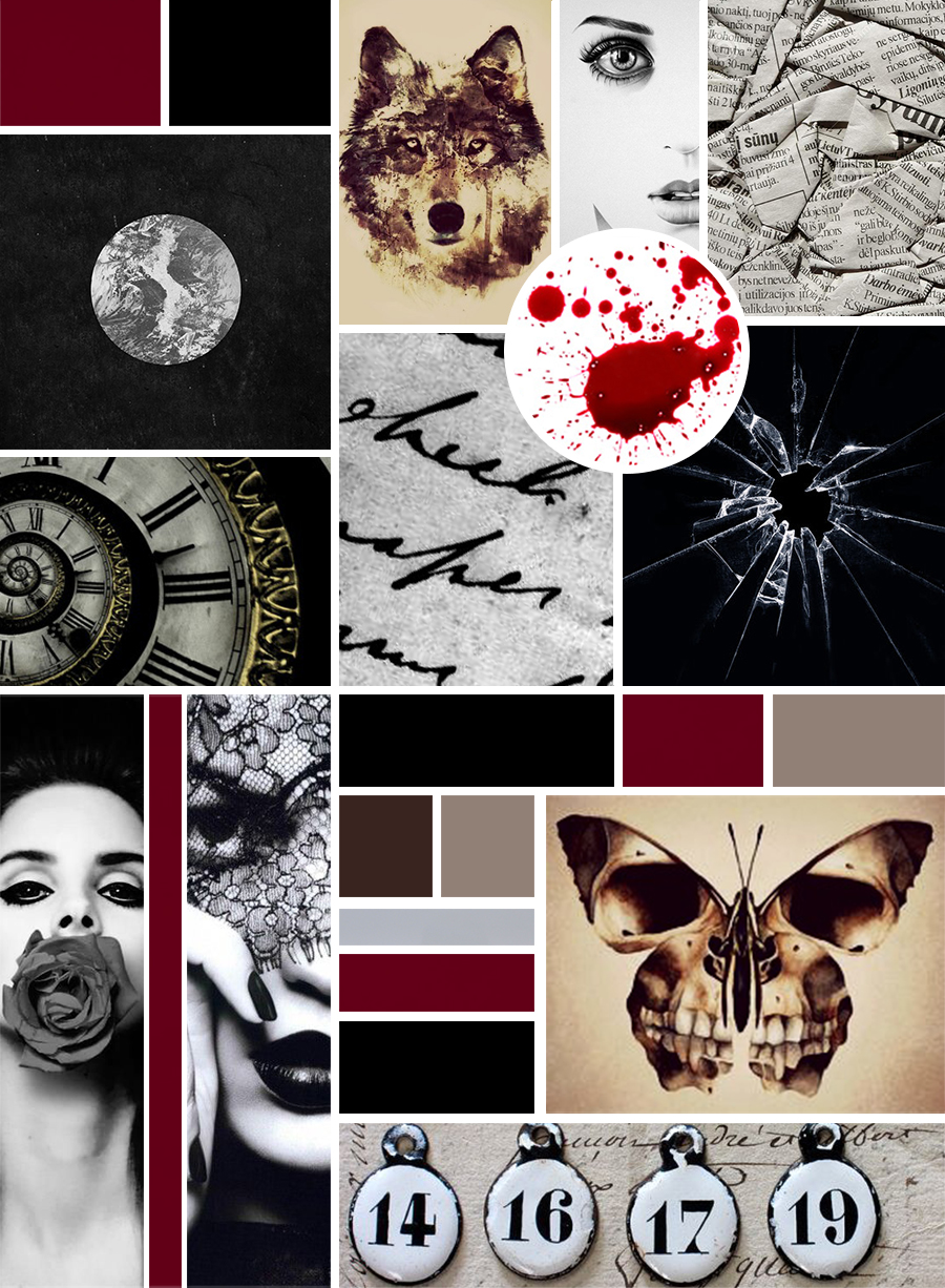
Explanation of Mood Board
The mood board attempts to represent Vivian psychologically through use of colour schemes and semiotics. The eye is naturally drawn to the blood splatter and it holds a certain shock factor to it, ultimately keeping one’s attention to delve in further. The many uses of a circular shape reveal how whatever Vivian and Jim discuss is between them only – enclosed to never be passed on.
The numbers are symbolic of Vivian’s victims, as she only sees them as numbers. The butterfly that has a skull on its wings and the wolf are both symbolic of the same thing: innocence and appearance versus reality. Vivian, someone so young and beautiful is a killer. This is why both images are the same taupe and chocolate brown colour scheme.
The grey circle with a black background is representation of Vivian’s enclosed turmoil of emotions, in order to maintain her sanity and block off any sense of self. It is the only way she can save herself from feeling anything about what she does. The twisted clock shows the passage of time between the killings and also planning of killings. The black and white handwriting also shows how the murders are premeditated and the crumpled up newspaper shows how Vivian refuses to know how her killings could affect anyone or anything.
Vivian’s reaction of shock, above the blood, is her reaction upon discovering that Jim killed her mother. She has just stepped out the shower, when an anonymous person had sent her a clip of the incident. She almost does not want to believe that it was Jim. The shattered glass image reflects this feeling.
The rose covering Vivian’s mouth shows how she’ll never tell anyone who she really is and what she really does. Only ‘good’ things will come out her mouth when speaking to others. The lace covering Vivian’s eyes is symbolic of the moment she secures Jim, as well as how she refuses to notice the reality of her murderous acts. The burgundy blood colour in between these two images is like a stream of blood and it creates this effect for the rest of the mood board as well.
The colours of focus are presented on the mood board: black, burgundy blood red, taupe, chocolate brown and steel grey. These colours are repetitive throughout the narrative, but are most prominent when Vivian’s psychology changes when certain events occur near the end of the story. In this way, these colours effectively enhance the emotional relevance of the protagonist throughout the narrative.